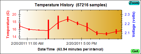
This chart shows a time-ordered History of temperature samples and, optionally, other sensor samples. PIMs can keep up to 8192 sensor samples in their History memory. Initially, every temperature sample is saved and displayed. At the default sample rate of 60-seconds, the History chart can show 1 sample per interval for the first 5.6 days that the PIM runs. When the memory is full, the History is compressed by doubling the interval and keeping only the minimum and maximum values for each interval. The resulting intervals are displayed as bars rather than points. This technique allows a History to be maintained for the full time the PIM runs without ever missing a significant temperature excursion. The actual sample rate (60-seconds) never changes, just the reporting interval. The image below shows what you would see if you zoomed-in to part of the above chart.
Beginning with version 3 of PIM Control, small triangles are used as markers to indicate significant events that occur while the PIM is running. In the image below, the purple markers at the beginning and end of the graph indicate that items have been added to the PIM's
Log. The green marker at the beginning indicates that the monitored product was "good" at the beginning of the trip, while the red marker at the end indicates the product was "bad" when it arrived. Additional information is displayed as you move the mouse over the markers. Marker display can be disabled using the
Layout Editor.
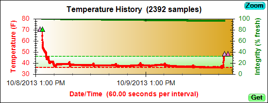
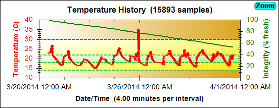
The History Chart also displays the results of temperature range checks,
MKT range checks, and
Integrity computations (see the
Check Alarms,
Check MKT, and
Compute Integrity mission steps). In the chart below, the yellow band indicates the desired shipping temperature range. Note that the high temperature limit was exceeded, indicated by the red dashed line. The green band indicates the desired
mean kinetic temperature (MKT) range and shows that the MKT stayed in range, despite the brief high excursion. Finally, the green line shows the computed Integrity of the product.
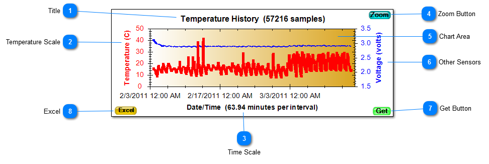
 TitleThe title indicates the actual number of temperature samples taken.
|
|
 Temperature ScaleIndicates whether the temperature is being displayed in Celsius or Fahrenheit. Use Edit Menu / Preferences to change the units. The change will occur the next time the chart is displayed. |
|
 Time ScaleThe Time Scale indicates the current length of the History interval. The minimum and maximum temperatures are displayed for each interval. Intervals are automatically adjusted so that the History never runs out of memory.
|
|
 Zoom ButtonPressing the Zoom Button causes the History to expand to fill almost the entire PIM Control window. Pressing it again returns the History to its normal size. Portions of the History can be zoomed by selecting a rectangular area of interest with the mouse. Use the Chart Context Menu to undo the partial zoom. |
|
 Chart AreaRight-clicking the mouse anywhere in the Chart Area will display the Chart Context Menu. Dragging the mouse while holding down the left button will select an area to enlarge. Dragging the mouse with the left button and the Shift key down will scroll the Chart Area. |
|
 Other SensorsIf other sensors are enabled, their histories will share the Chart Area with the temperature history. Their scales will be displayed on the right side of the chart. In this example, the History includes samples taken be the Battery Voltage sensor.
|
|
 Get ButtonIf you have a PIM positioned in range of the reader, pressing this button will read and display the History from the PIM.
|
|
 ExcelPressing the Excel button causes an Excel spreadsheet to be displayed that summarizes the data from the PIM, including the temperature history in tabular form.
|
|